Halden
An identity and digital experience for a home fragrance and objects brand, built on a single architectural idea.

Five scents, three formats, one line. Every Halden object carries the same line, 40 mm above its base, so the family lines up wherever it stands.
Home fragrance sells a mood. Nobody sells the room.
The category speaks in soft focus: candles named after feelings, labels that could belong to anyone, the same beige still life on every shelf. Halden is for people who notice rooms, and who would rather know what something is made of than be told how it should make them feel.
- Positioning
Specified, not styled.
Fragrance and objects described the way an architect describes a room: material, proportion and use.
- Audience
People who furnish slowly.
Design-literate homes, small studios and hotel rooms that are meant to be lived in, not staged.
- Voice
Plain and exact.
Every name is one word. Everything else is a specification: notes, room size, burn time, refill.
- Difference
Objects that line up.
Put any two Halden objects side by side and their lines meet. The brand is visible in the arrangement.
The datum.
In architecture, a datum is the reference line everything else is organised around. A room feels quiet when its parts agree with each other. Halden makes that line its signature: one line, one-third up, on everything it makes.
- On objects
40 mm above the base, whatever the height.
- In type
The wordmark and every product name rest on it.
- In photographs
A horizon, ledge or sill one-third up.
- On screen
One line per view, shared by page and product.
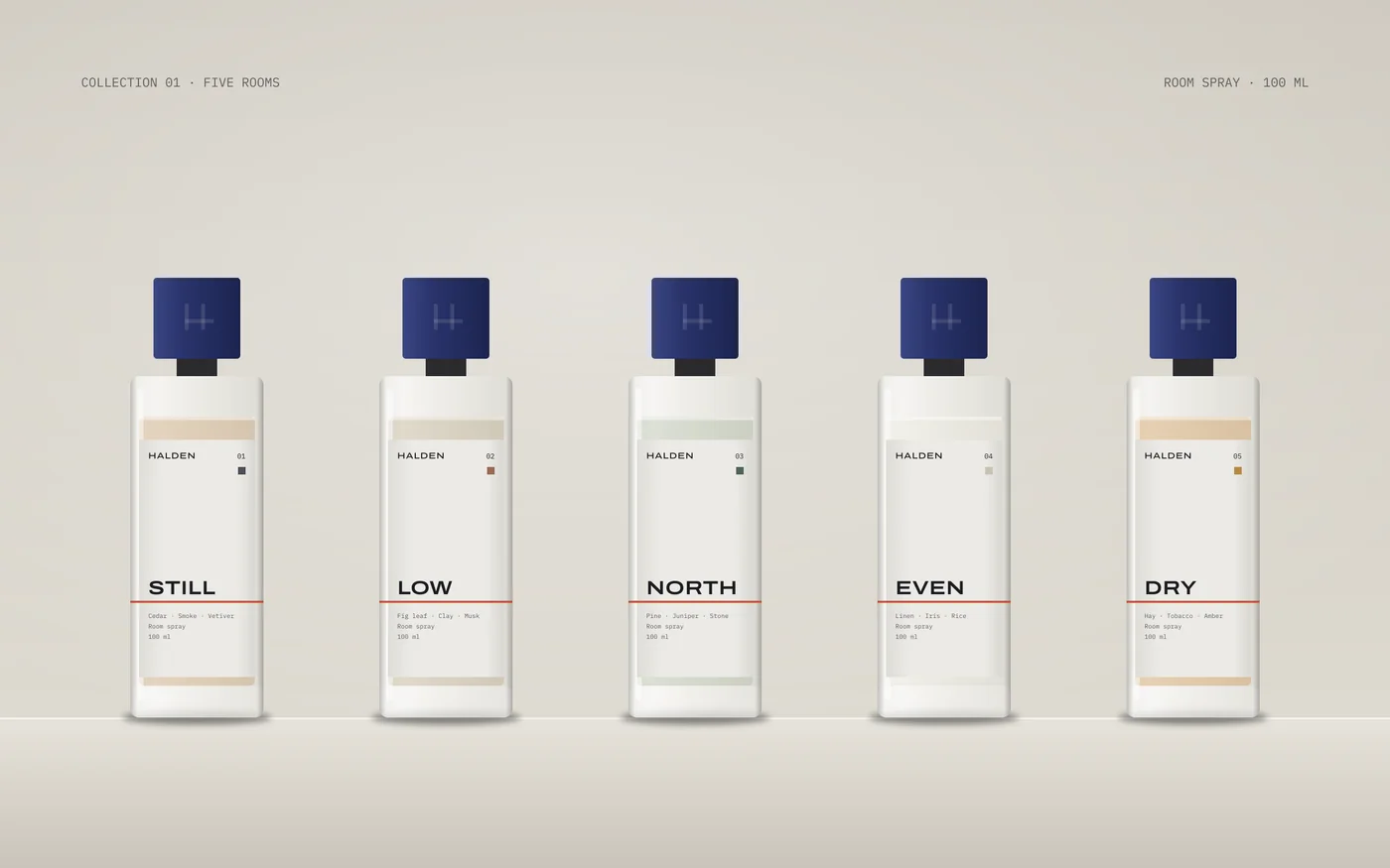
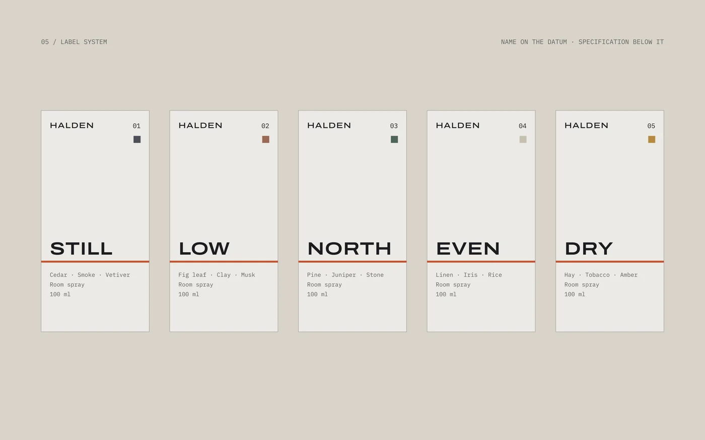
Collection 01: five rooms. One word per scent, a number, three notes. The line holds them together on the shelf.
A wordmark that rests on a line.
The wordmark is set wide and sits on its own datum, which runs on to the edge of whatever carries it: a label, a box, a browser. Where it cannot fit, the monogram stands in: an H whose crossbar sits low, on the line.
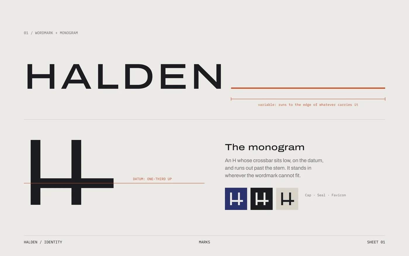
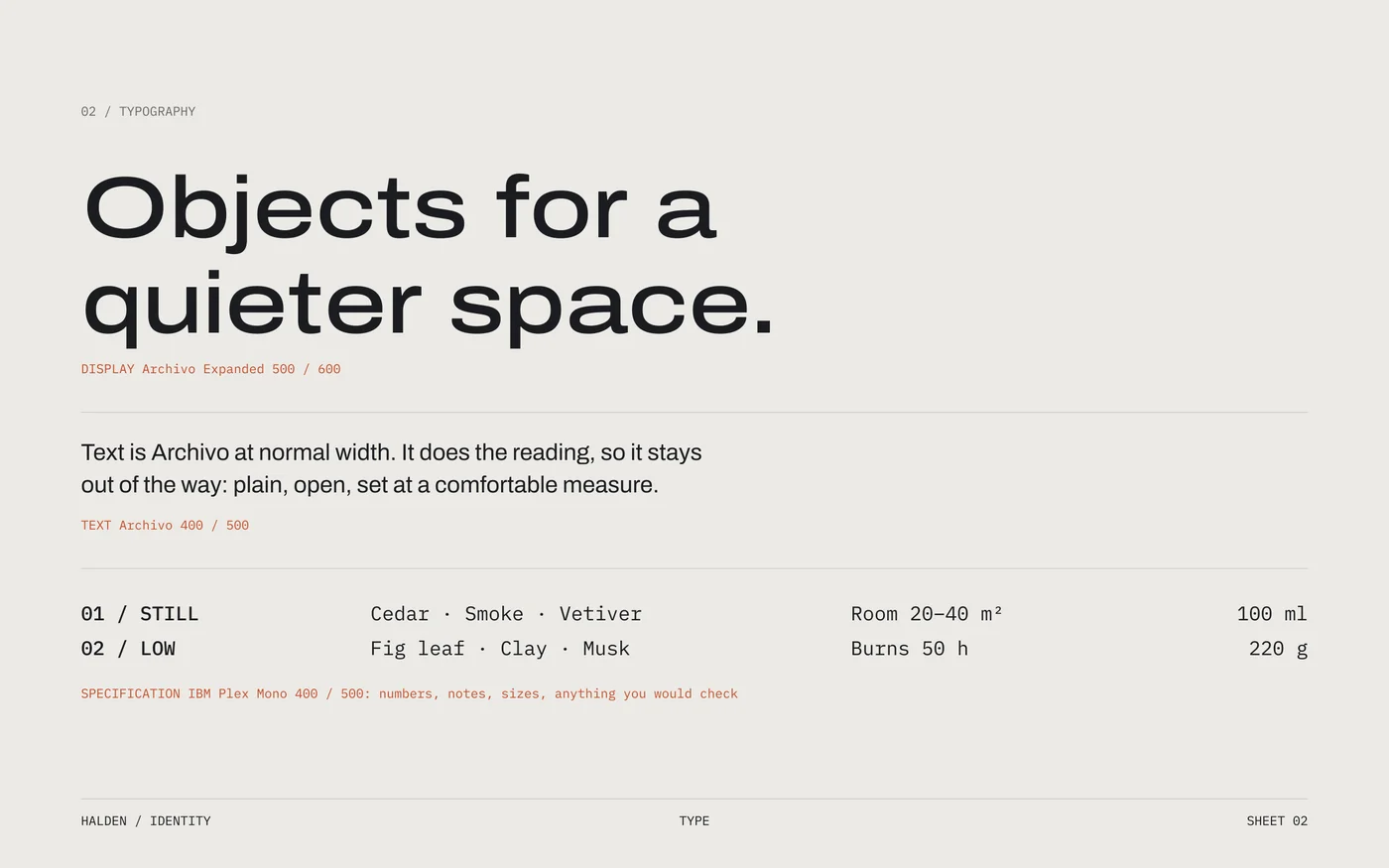
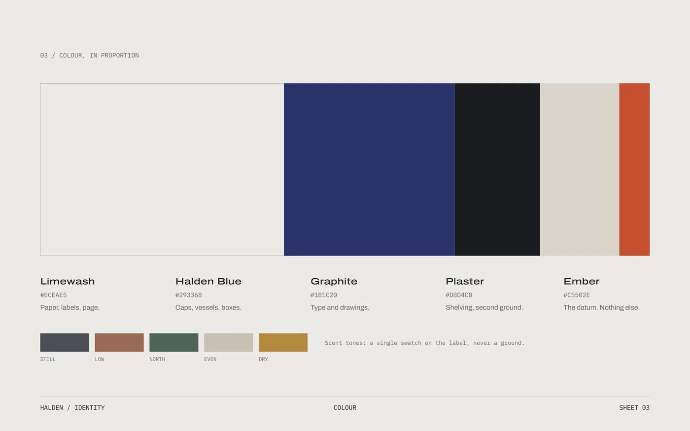
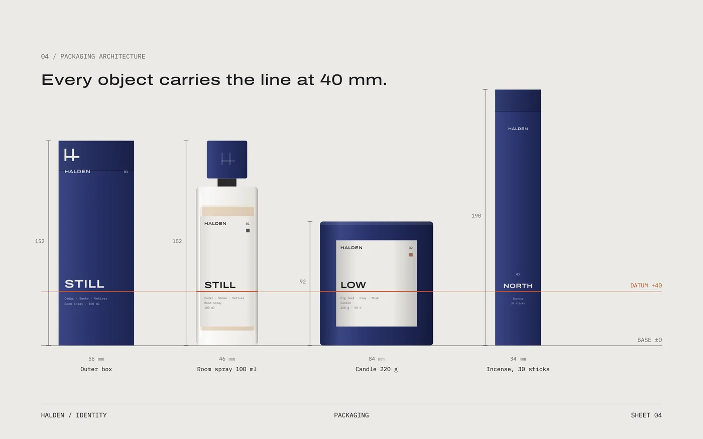
Every object carries the line at 40 mm.
Room spray, candle and incense differ in height, but not in where the line sits. Any combination on a shelf reads as one composition, and new formats inherit the rule rather than a new layout.
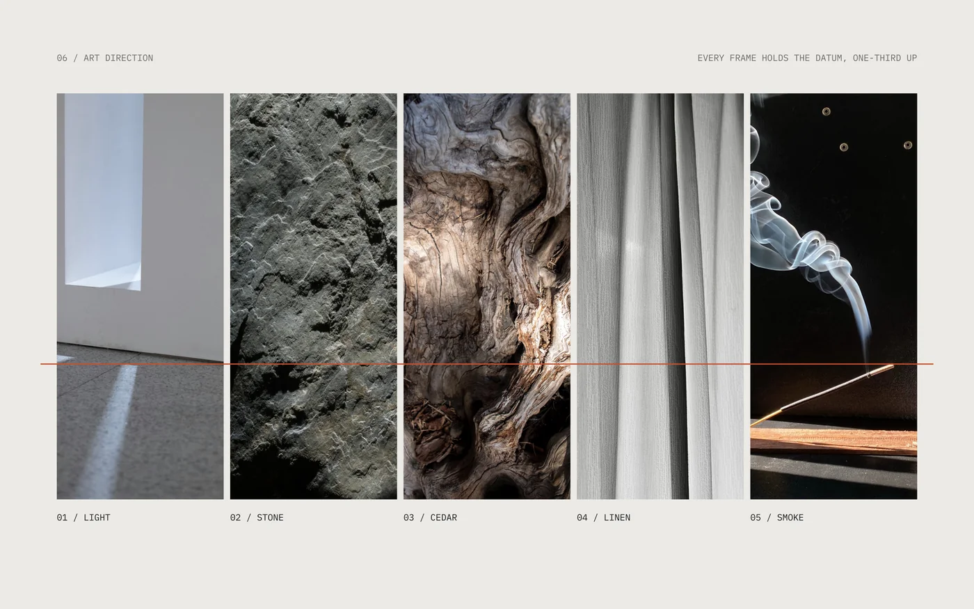
Photographs hold the same horizon.
Architectural light and material close-ups, never lifestyle. Each frame is cropped so a floor line, ledge or edge falls one-third up, so the brand's photography lines up the way its objects do.
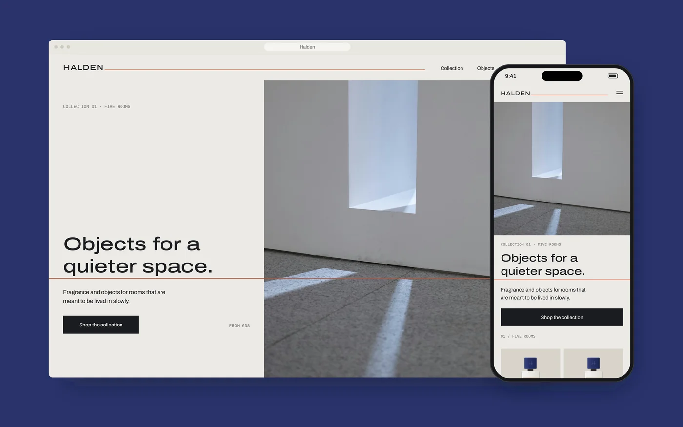
The site keeps the line too.
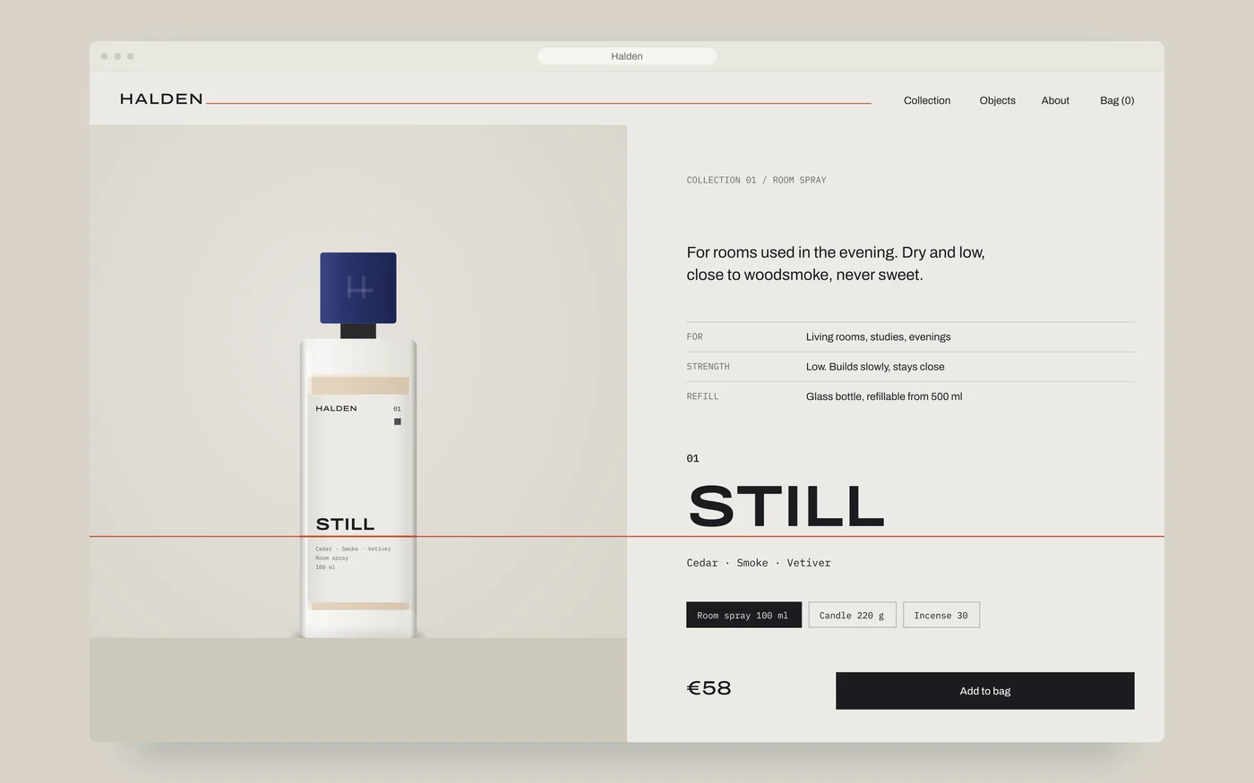
Every view has one datum. On the product page, the bottle's line and the page's line are the same line, with the product's name resting on it. The website is the packaging, at screen scale.
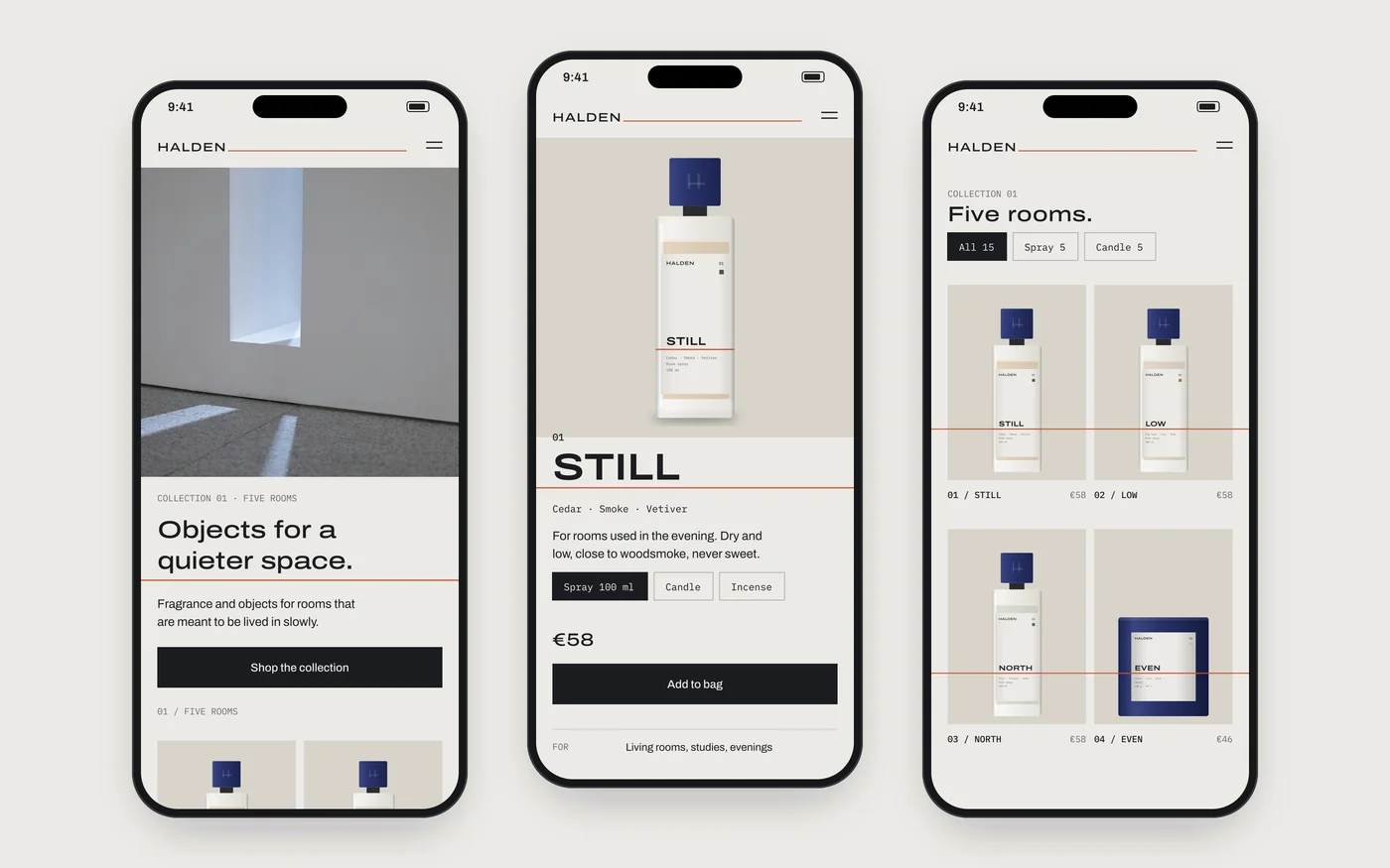
One rule, every touchpoint.
The identity is a rule anyone can apply, not a set of finished artworks. Insert card, mailer, social post, retail fixture, seal and card all follow it, and none needed a new idea.
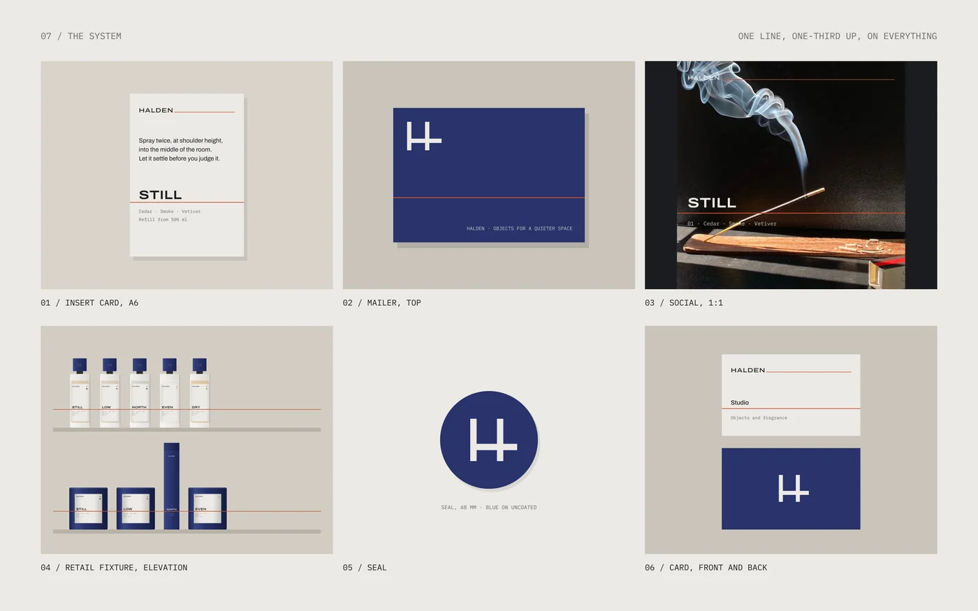
A brand you can recognise by a single line.
And a system simple enough to grow without losing it.
Recognisable at a distance.
The line reads across a room before the name does.
Grows by rule.
A new format inherits the 40 mm line; a new scent gets a number and a word.
One language, box to browser.
Packaging, print and the website share type, colour and the datum.
Built to be specified.
Mono specifications make every product as legible to a buyer as to a customer.
Have something worth
getting right?
Tell us what you're building.