The Good Stuff
A manufacturer-direct store, designed so that a short list feels like the whole point.
shopthegoodstuff.co
- 5departments
- 37shelves
- 7questions every product has to pass
- 1price on every product, no countdowns
Nobody needed another place to buy everything.
Marketplaces already sell almost anything, in endless volume, and leave the choosing to you. The Good Stuff works the other way round: it buys close to the people who make things, keeps only what passes its own standard, and asks to be trusted for the edit. The design had to make that short list read as the point, not a limitation.

What the design had to answer
- How does buying from manufacturers read as a benefit, not a shortcut?
- What earns enough trust for a first order from a name nobody knows yet?
- How does a store with five departments feel curated, not crowded?
- How do you signal quality without shouting about it?
The edit is the product.
Seven questions decide what gets listed. Does it look good, does it work, is it well made, is it worth the price, would we want it, can the supplier make it well, does it belong here. Most things fail at least one.

Closer to the source, and clear about the limits.
Manufacturer-direct is easy to oversell. The store treats it as a claim to explain, not a badge to stamp on everything.
- 01
Manufacturers
Where things get made. We start here, not at the end of a chain of resellers.
- 02
The Good Stuff
We keep a little of what we see, and write it down properly.
- 03
You
A short list, with the details you need to decide.
“It does not mean we own a factory, that nobody else is involved, or that we are always the cheapest.”
The limit of the claim sits next to the claim. From the store’s own answer to “What does manufacturer-direct mean?” A new name earns more trust by saying what it isn’t than by adding another badge.




Most things are made far from where they are sold. We cannot change that. We can be straight with you about it.
The Good Stuff homepage, “Where things come from”Five departments. Thirty-seven shelves. One standard.
Discovery narrows rather than widens: department, then shelf, then product. Jewellery, watches and fragrance are shelves inside a department, not a sprawl of top-level categories.
- 01ElectronicsBattery · Compatibility · Build
- 02Beauty & Personal CareIngredients · Volume · Use
- 03Home & KitchenMaterial · Size · Care
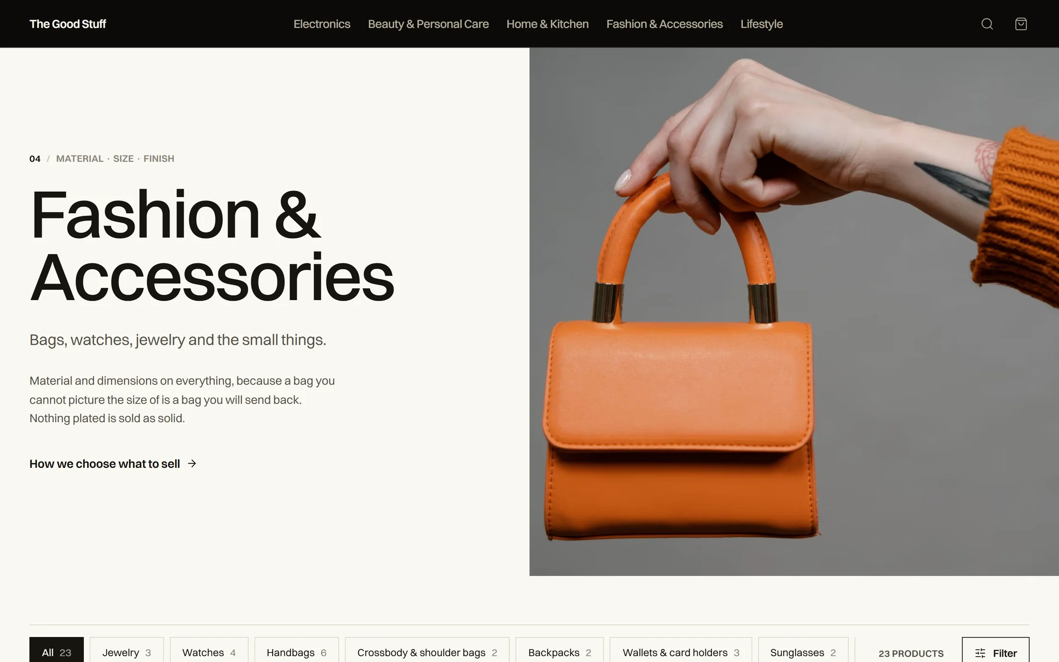
- 04Fashion & AccessoriesMaterial · Size · Finish
- 05LifestyleMaterial · Size · Weight
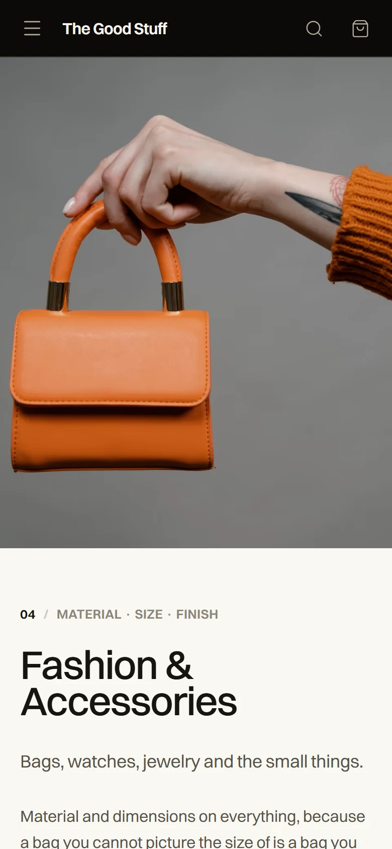
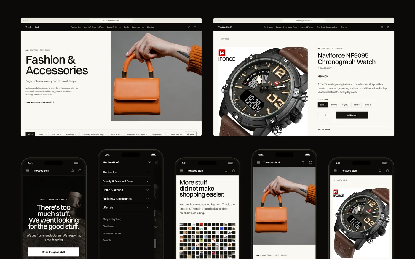
The live Fashion & Accessories department with its Watches shelf selected: every shelf, count, product, name and price as the store shows them today.
Fashion & Accessories
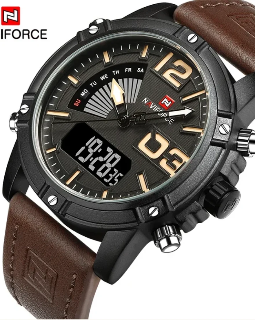 WatchesNaviforce NF9095 Chronograph Watch₦38,400
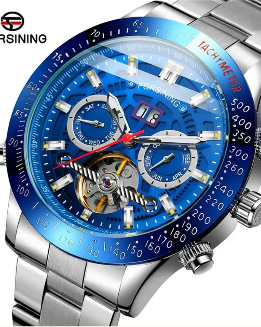 WatchesForsining Automatic Skeleton Watch₦72,231
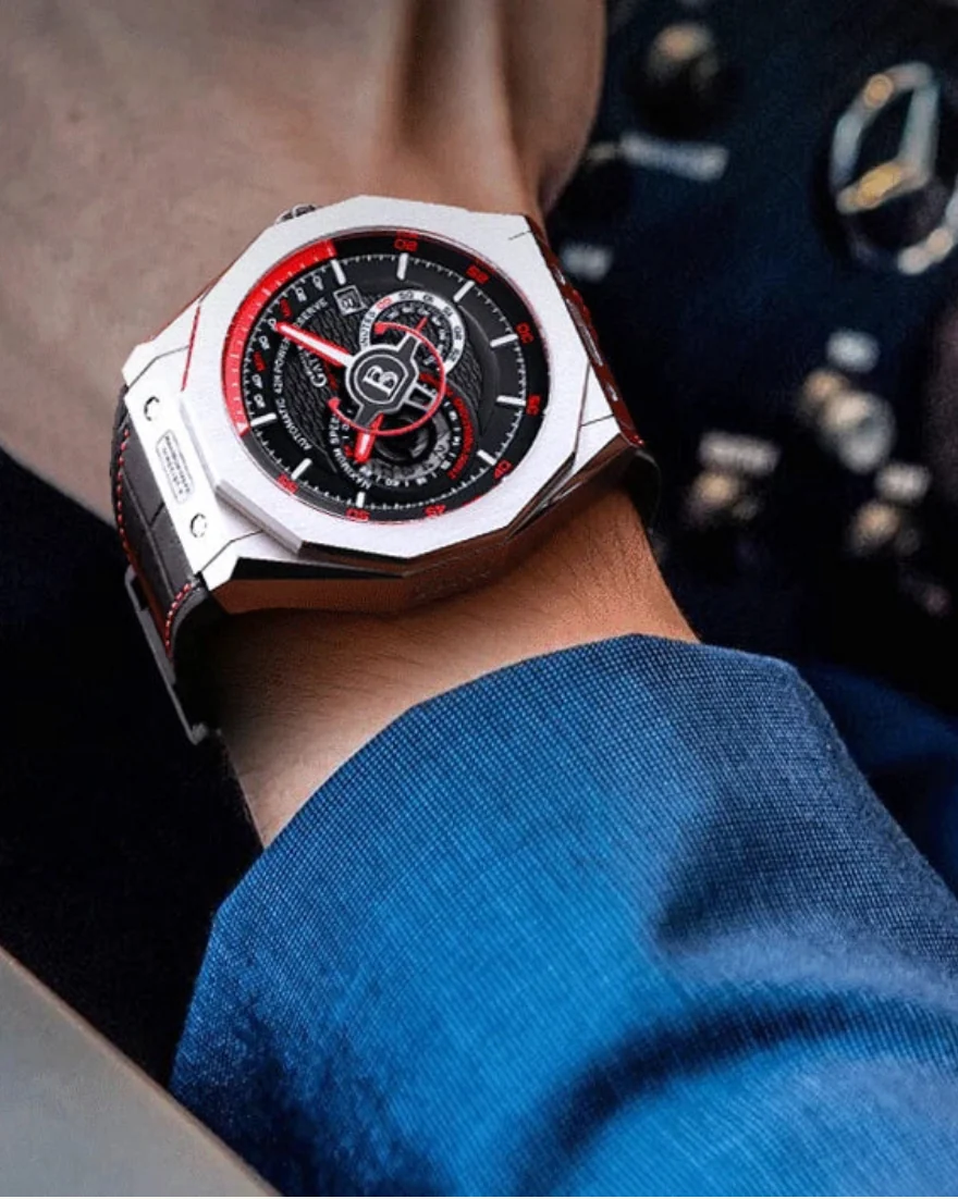 WatchesBonest Gatti BG8601 Automatic Skeleton Watch₦660,528
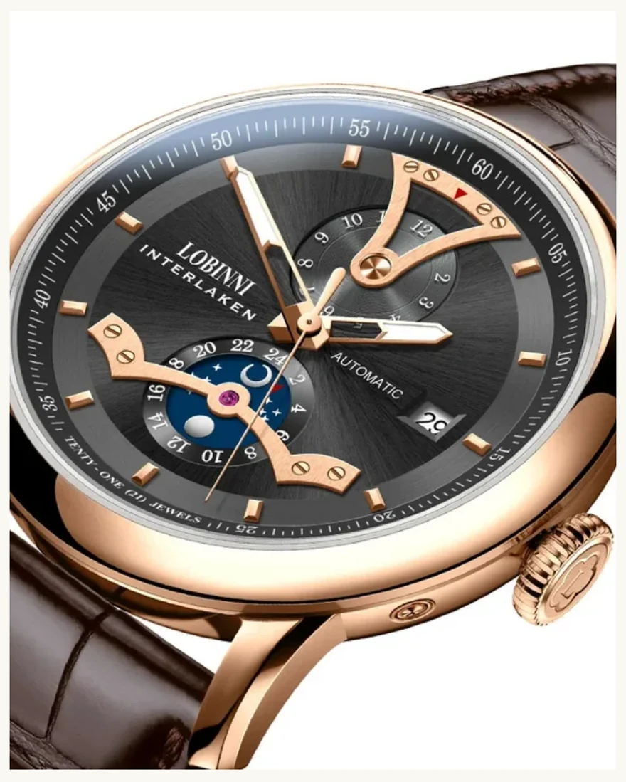 WatchesLobinni 18018 Automatic Watch₦324,949
One idea per screen.
The homepage is a sequence of full-screen frames rather than a stack of blocks. Each frame makes one argument, in the order a sceptical first-time shopper needs them.
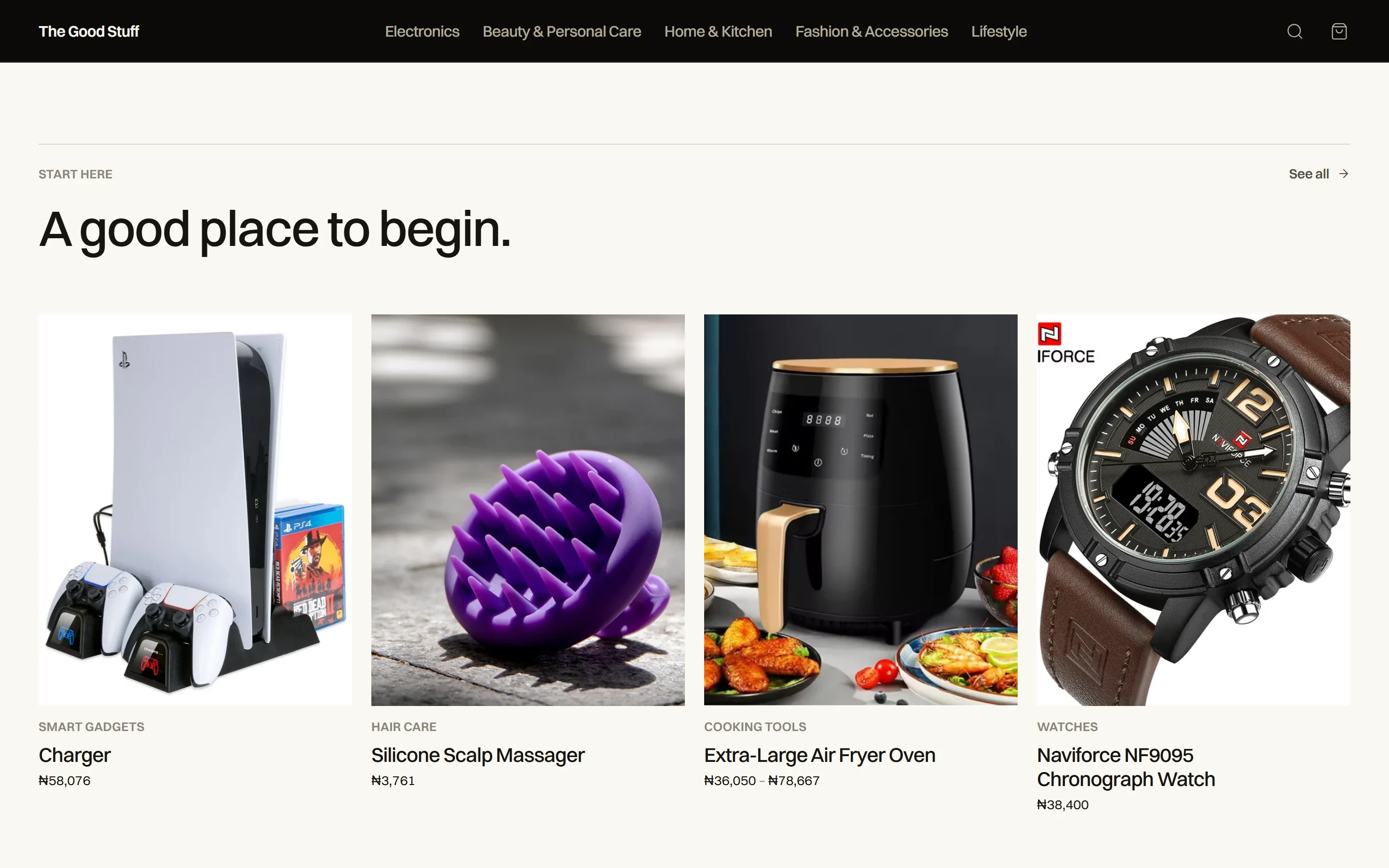
01Somewhere to start. A short rail of real products, with the shelf above the name and the price below it. 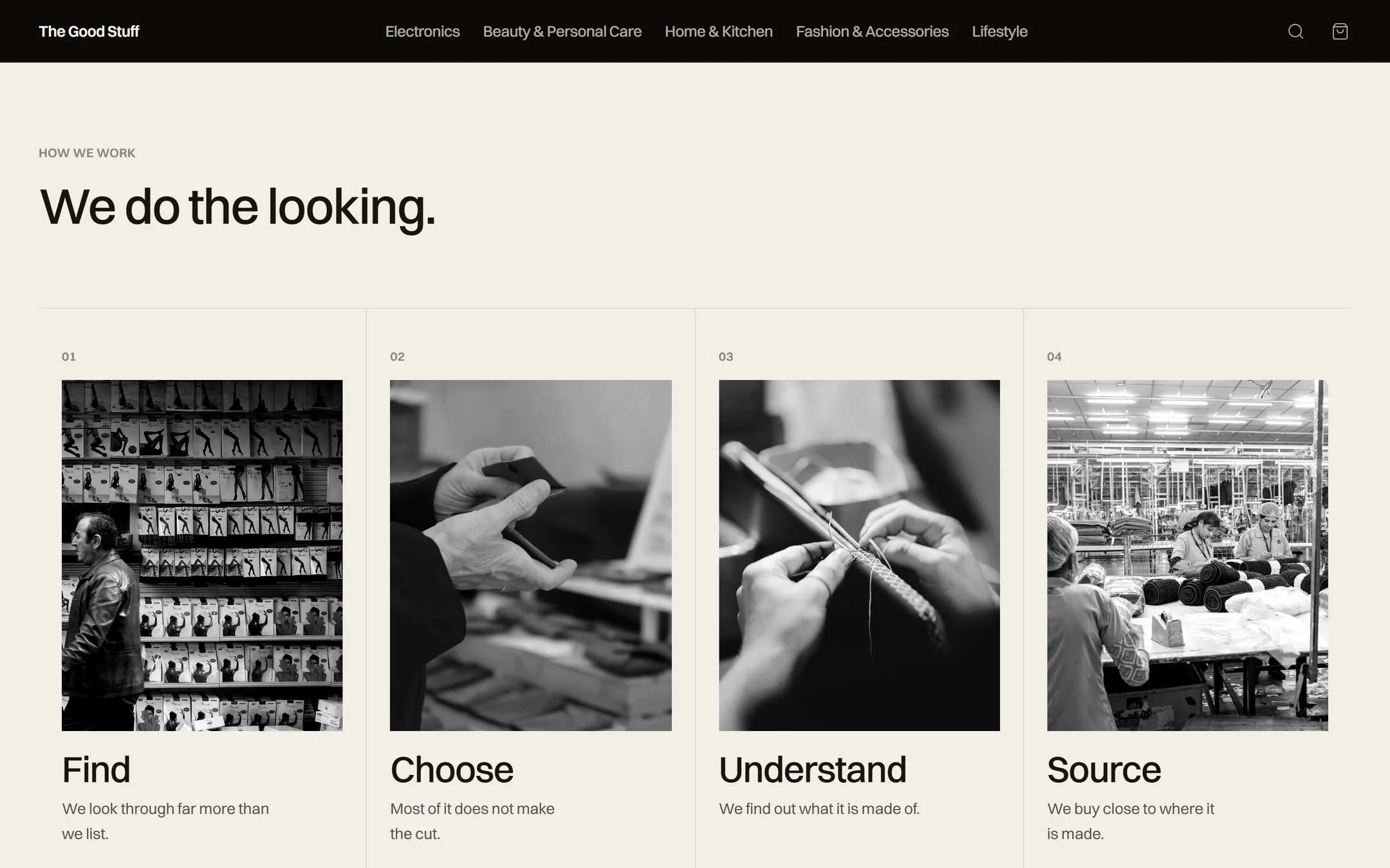
02The method. Four verbs, four photographs, one line each. 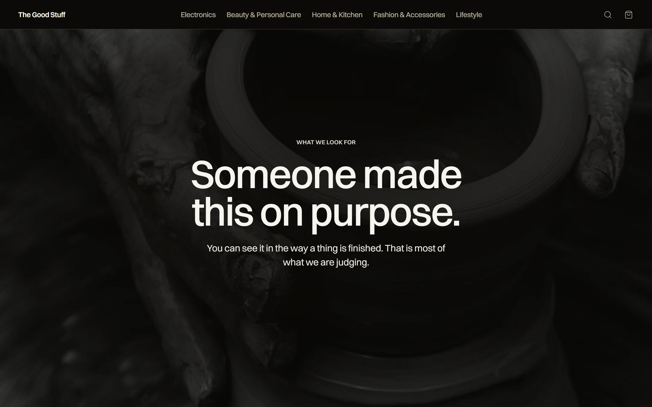
03A point of view. Editorial frames give the store a voice a marketplace can’t have. 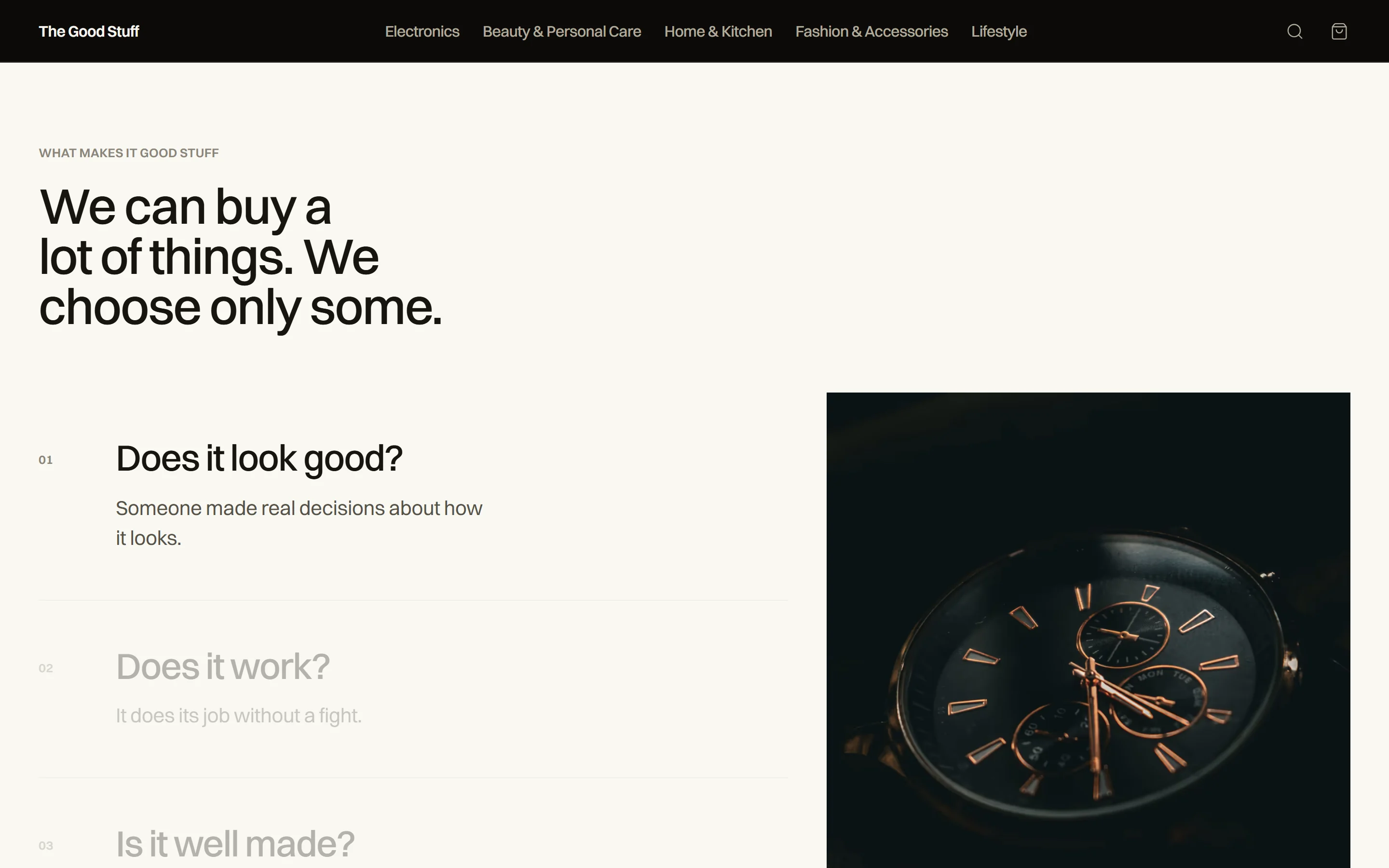
04The standard. Seven questions, revealed one at a time as you scroll, each with its own photograph. 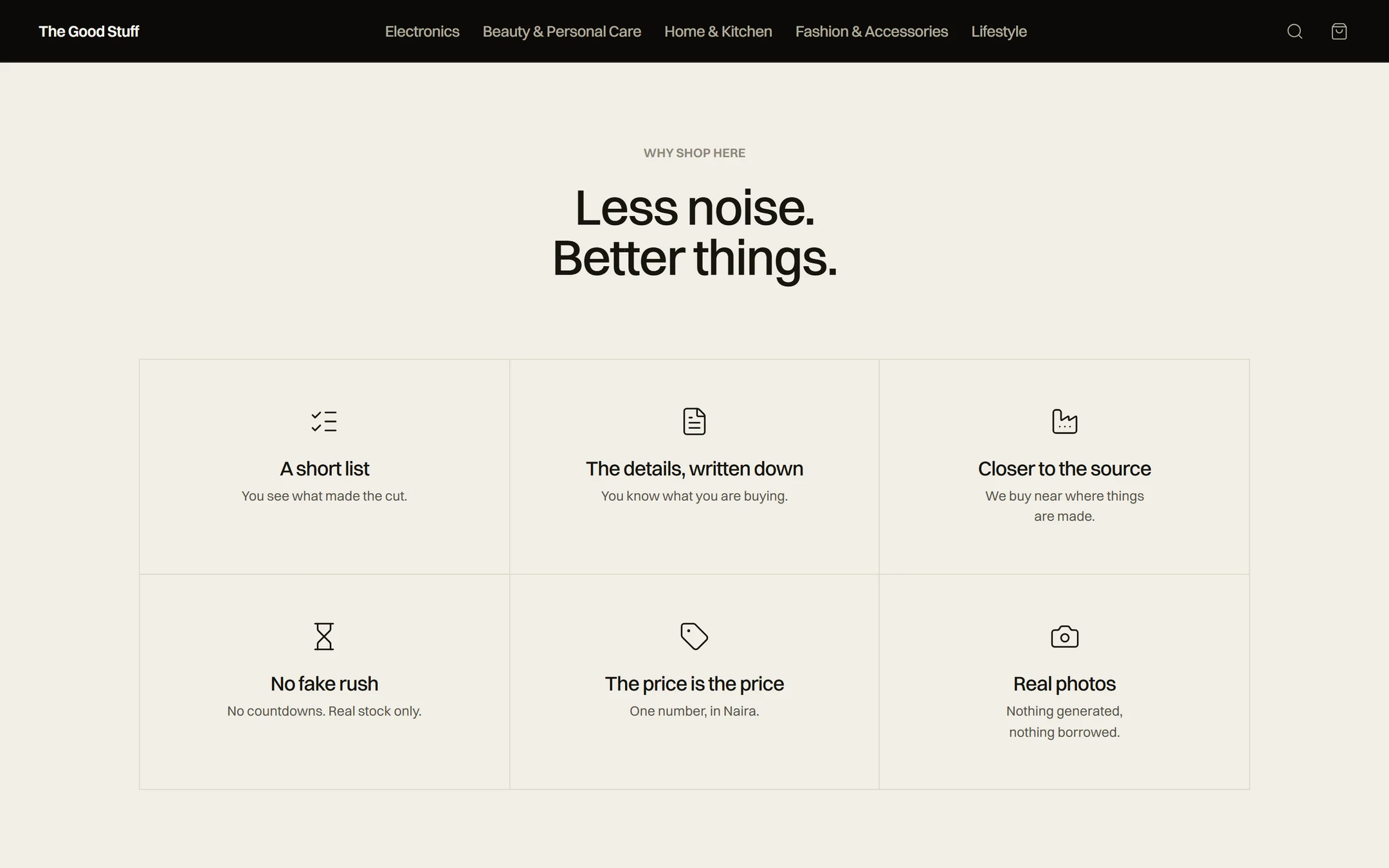
05The reasons. Six promises, each one the store can actually keep. 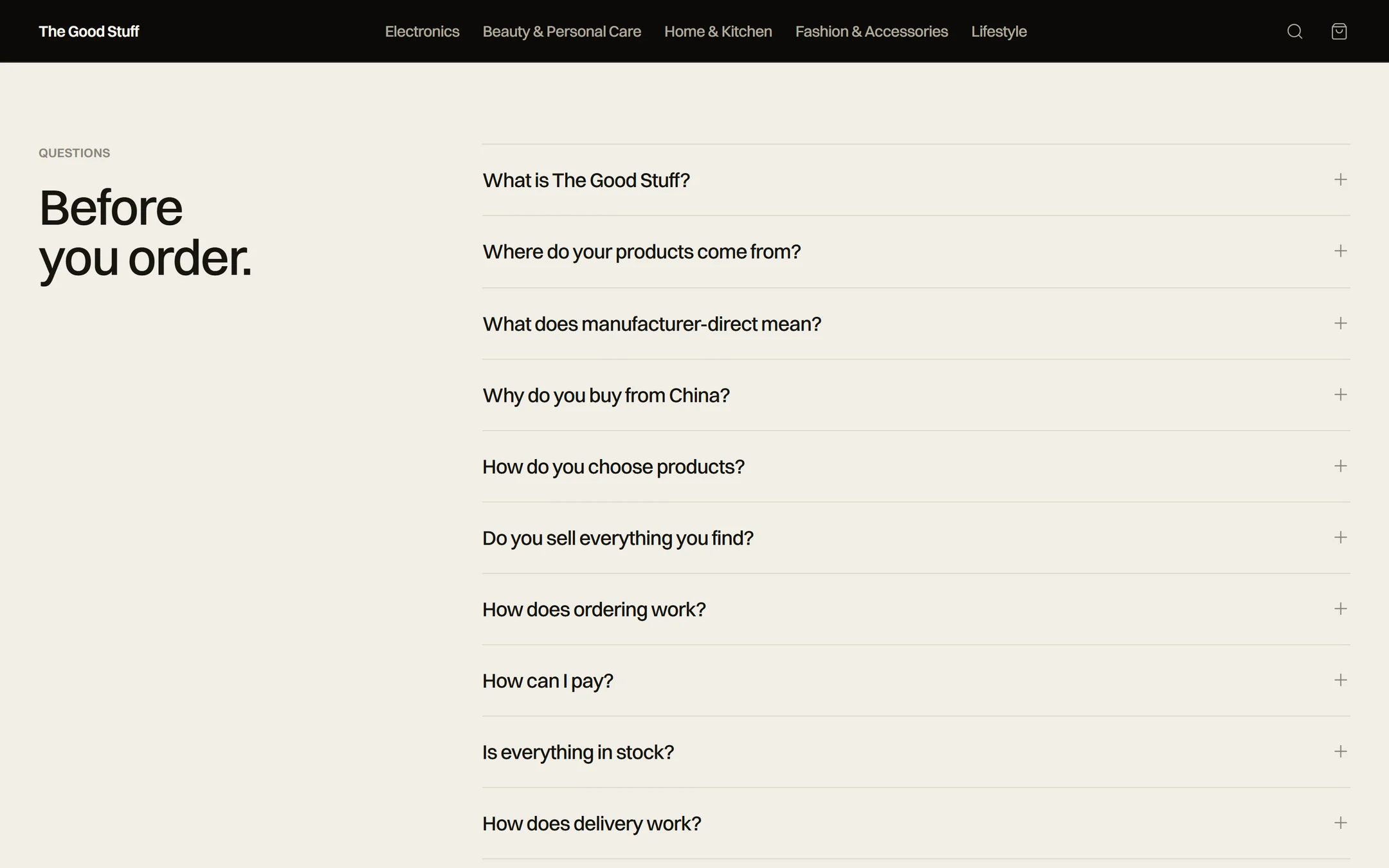
06The objections. Thirteen plain answers before the first order.


Photography sells before the copy does.
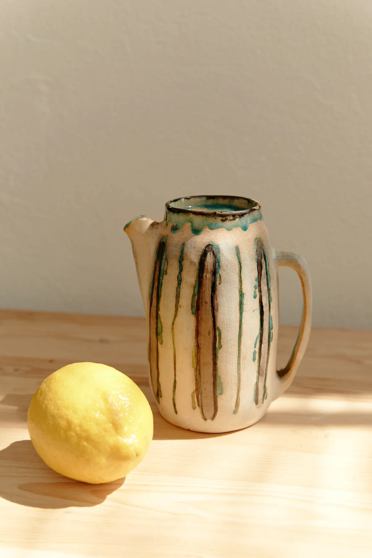
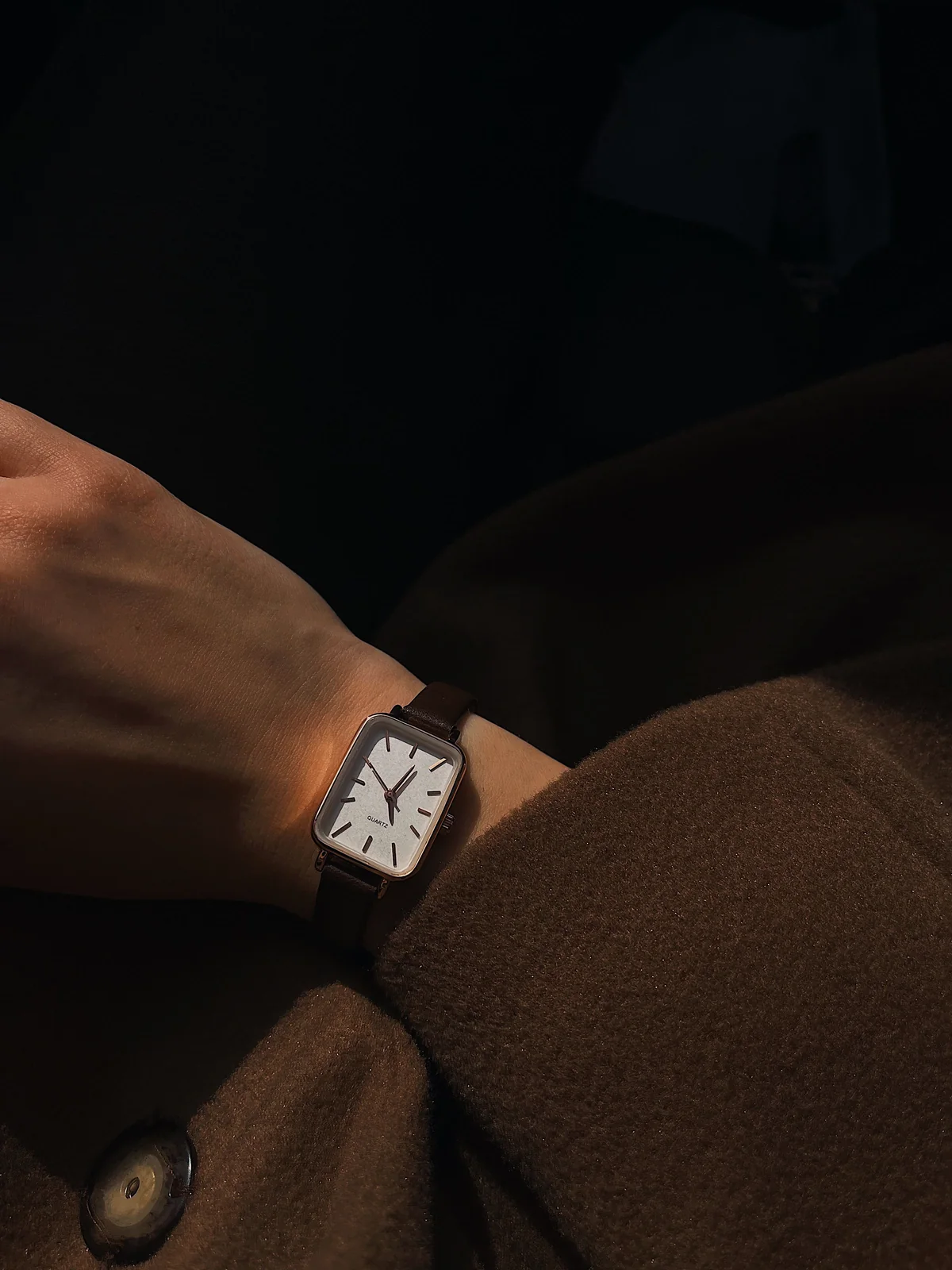
Two kinds of image, two jobs. Editorial photography sets the standard for the whole store. Supplier photography, on clean ground, closes the sale.




- 01
Product, not lifestyle.
Tight crops that read as product photography.
- 02
No faces to camera.
The object is always the subject.
- 03
One temperature.
A single warm grade holds the set together.
- 04
Nothing generated, nothing borrowed.
Every image is licensed and logged, and any frame carrying another brand’s logo is rejected.

Built for a mid-range Android on mobile data.
The launch market means a mid-range Android on mobile data, where data costs real money. The storefront was designed, and budgeted, for that phone first.
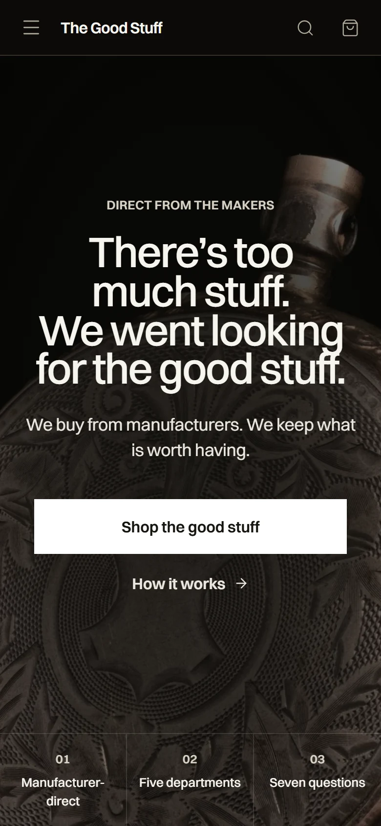
The promise, full-screen. One primary action, full width, in thumb reach.
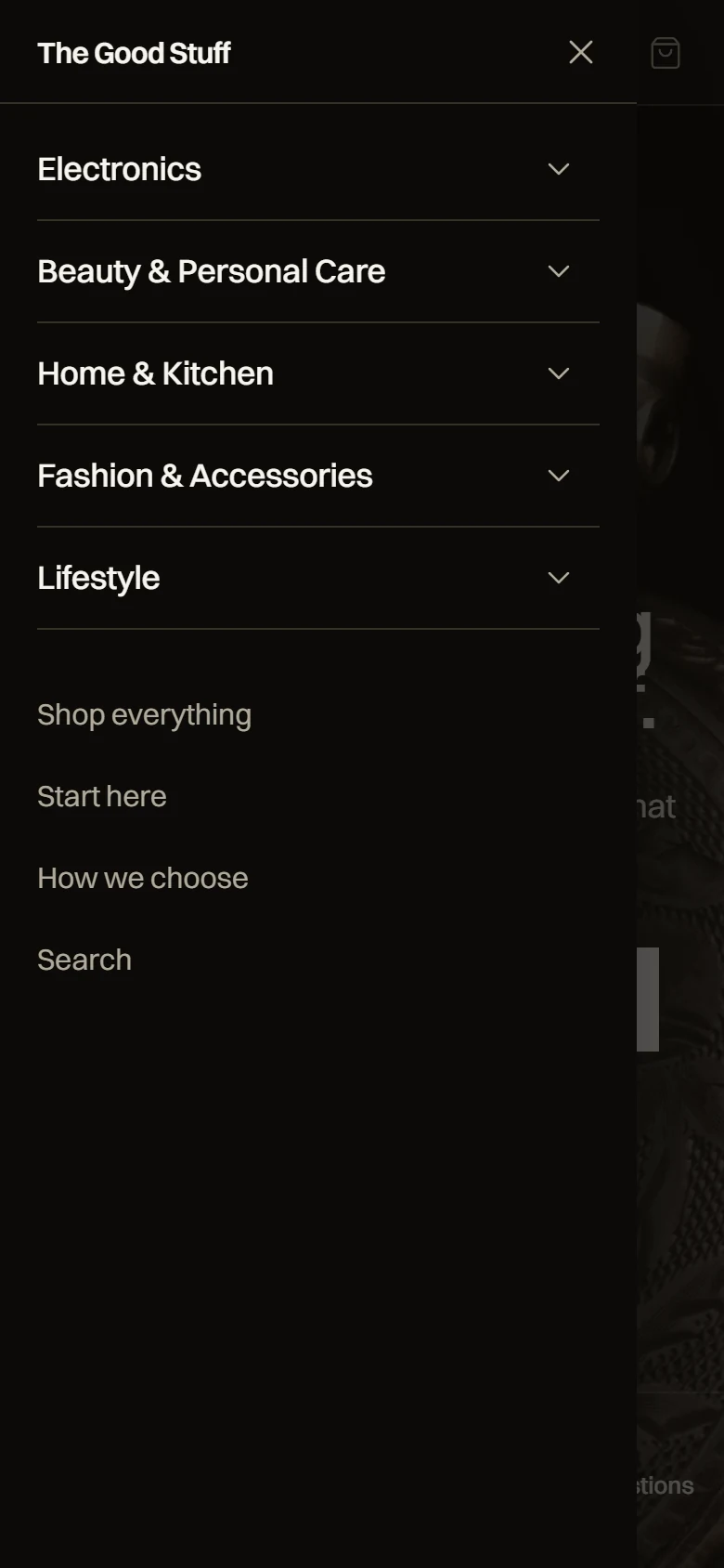
One drawer. Five departments that open into their shelves, then four short paths.
Departments, standard first. The three things it is judged on, before a single product.
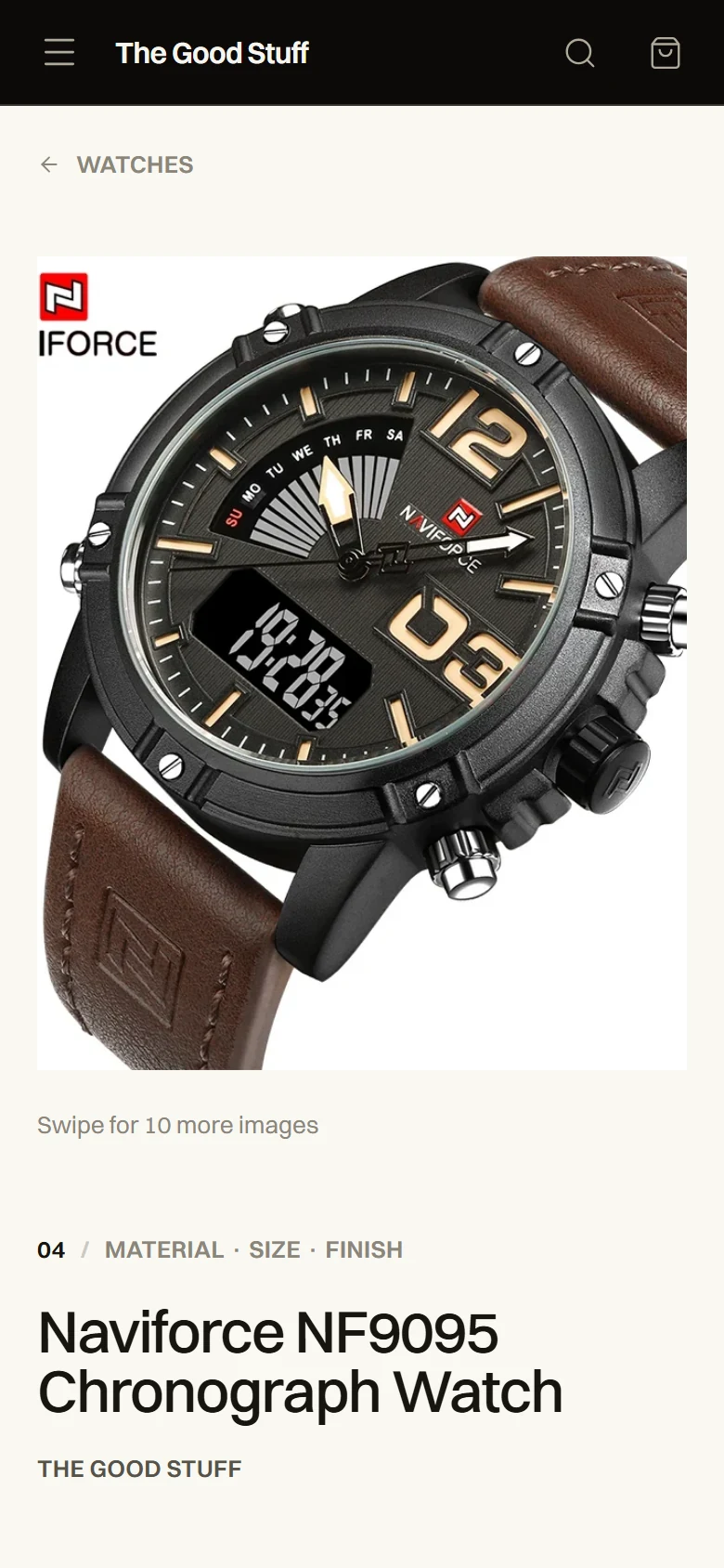
Product first. Image, standard, name and price before anything else.
- 102 KBShared JavaScript on first load, against a 105 KB budget
- 122 KBOn the product page, against a 125 KB budget, variant picker included
- 6.1:1Minimum contrast for text over photography, checked at 320, 375 and 1440 px
Measured during the Phase 1 build. Budgets are tuned for a mid-range Android on mobile data, not a desktop on fibre.
No countdowns. No fake discounts. Just reasons to buy.
A new shop converts by being believed. The product page answers the questions people have before they pay, in the order they have them.

- The price is the price. One number, in the shopper’s currency. No struck-through “was” prices.
- The standard, above the title. Each product carries its department’s three criteria.
- Answers beside the button. Specification, details, and sourcing and provenance sit right under Add to cart, not in a footer.
- Real stock. Stock comes from real inventory. When something runs out, the page says sold out.
- 01Product page
- 02Cart
- 03Shopify checkout
- 04Paystack payment


Restraint, written down.
A closed type scale, a warm neutral ramp and one accent. Small on purpose, so five very different departments still feel like one shop.
Switzer
There’s too much stuff.
- Regular 400
- Medium 500
- Semibold 600
A Swiss grotesque, self-hosted, three weights. Every size comes from a closed set of named steps: no arbitrary font sizes anywhere in the code.
- Ink#16150F
- Ground#FAF8F3
- Surface#F1EEE6
- Line#DDD8CB
- Bronze#8A6A3B
- Frame#0B0A07
A warm near-black and a warm off-white, with three greys between. One bronze accent, kept for focus and a single primary action.
04 / Material · Size · Finish
- Radius 0. Defined as a token, so it reads as a decision.
- No shadows. Space and hairlines do the separating.
- Fixed image ratios. Space reserved per surface, so nothing jumps as photographs load.
- One container. Every page composes from the same few primitives.
A quiet signature, built from the same rules.
A Swiss grotesque wordmark that ends on a square full stop, and a monogram where the T becomes a roof over the G and S. Radius zero, all the way down to the punctuation.



Have something worth
getting right?
Tell us what you're building.
